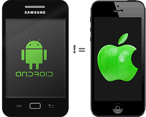
A common shortcut often taken is to make one UI work on multiple platforms, and I find myself fighting this misconception often. My thoughts on this were spurred by an article Mobile First, Desktop Worst, which basically takes on mobile first and responsive design as being flawed. I think many of the arguments presented in that article were also relevant to building mobile UIs for an app that exists on both iOS and Android.
UI development is the most time consuming aspect of developing mobile apps. As the app owner you may want your app to be the same on all platforms to try and minimize the work, but this thinking is wrong. Individual users don’t use your app on multiple platforms and expect a common experience, they use your app on their chosen platform and expect it to act like other apps on their chosen platform. An application which does not adopt the UI conventions of the target platform will have diminished success. Users now expect applications to match their platform experience, especially millennials or users who don’t have experience in other platforms.
Each platform has controls, widgets and interaction paradigms that do not exist on other platforms. One UI that works across all platforms will not take advantage of the unique features of each platform, becoming a compromised design that does not meet user’s expectations. The differences in each platform are typically what makes a quality user experience for that platform. The least-common-denominator approach of the sameness across platforms reduces the potential for adoption and success of an app on any given platform. Mobile usability and a fabulous UX are now expected, and your app won’t achieve that goal unless it exploits the platform and device features.
Many of the cross-platform tools make this mistake out of the gate and promise a two-for-one outcome, which is fallacious thinking. Don’t fall into this trap.